Anti
Category disruption in FMCG: a challenger alt-milk built to own the shelf.
Design
Naming
Identity
Voice
Packaging
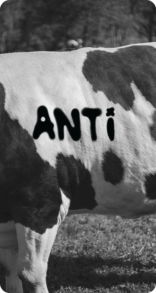
The challenge
Every competitor leans soft, beige, and bucolic
Anti goes the other way: black, white, and unapologetically loud, turning packaging into shelf presence and a point of view.
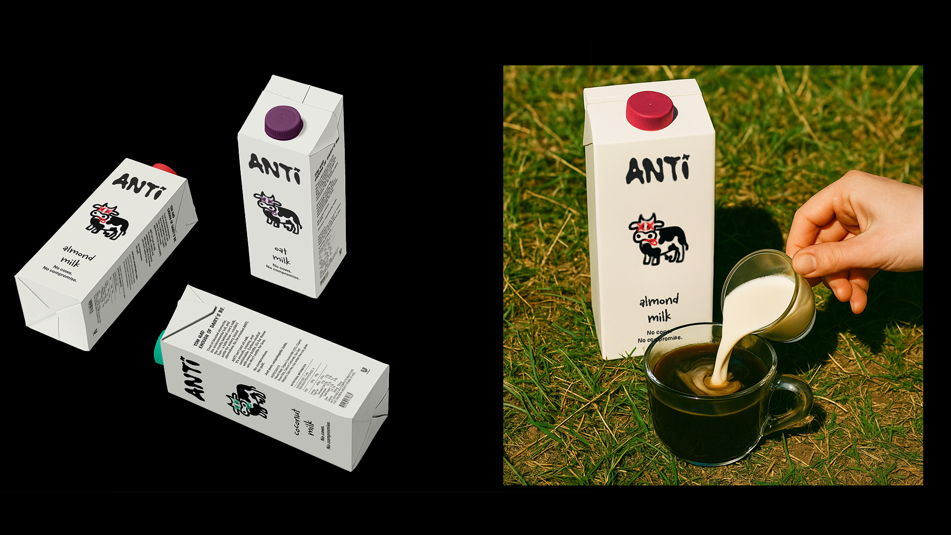
Tom had enough of dairy's BS.
No cows. No compromise.
The voice does the same work as the visual: blunt, declarative, and a little funny. A brand that picks a side and earns trust by saying out loud what the category whispers.
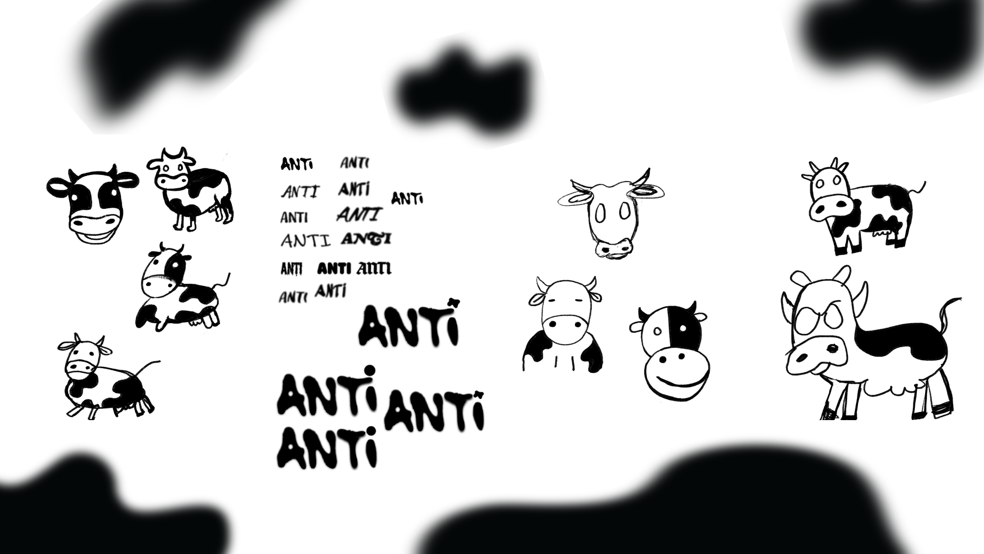
Building the mark
THE PROCESS BEFORE THE FINAL LOGO
The cow mascot and ANTI wordmark were iterated dozens of times to land on a mark that felt scrappy, defiant, and undeniably ownable.
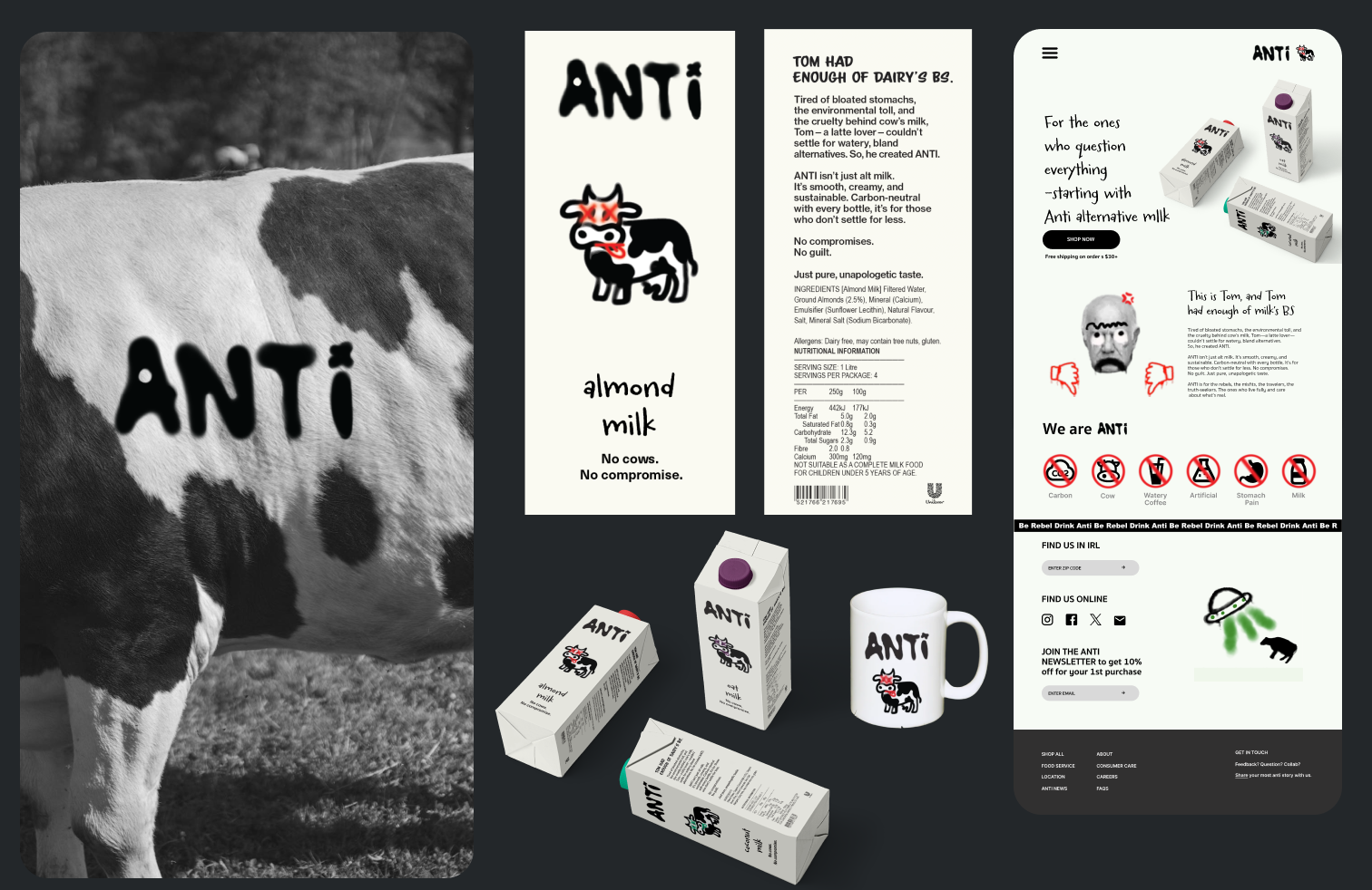
Beyond the carton
One character, every surface
The system extends from packaging into merch and a full digital experience.
Strategic note
BUILT FOR LIFETIME VALUE
“No cows. No compromise.” was a deliberate positioning choice, designed to recruit believers in a sustainability-focused market and drive higher LTV, not just one-off samplers.
- My role
- Solo designer: brand strategy, identity, packaging, illustration, web design, copy
- Year
- 2025