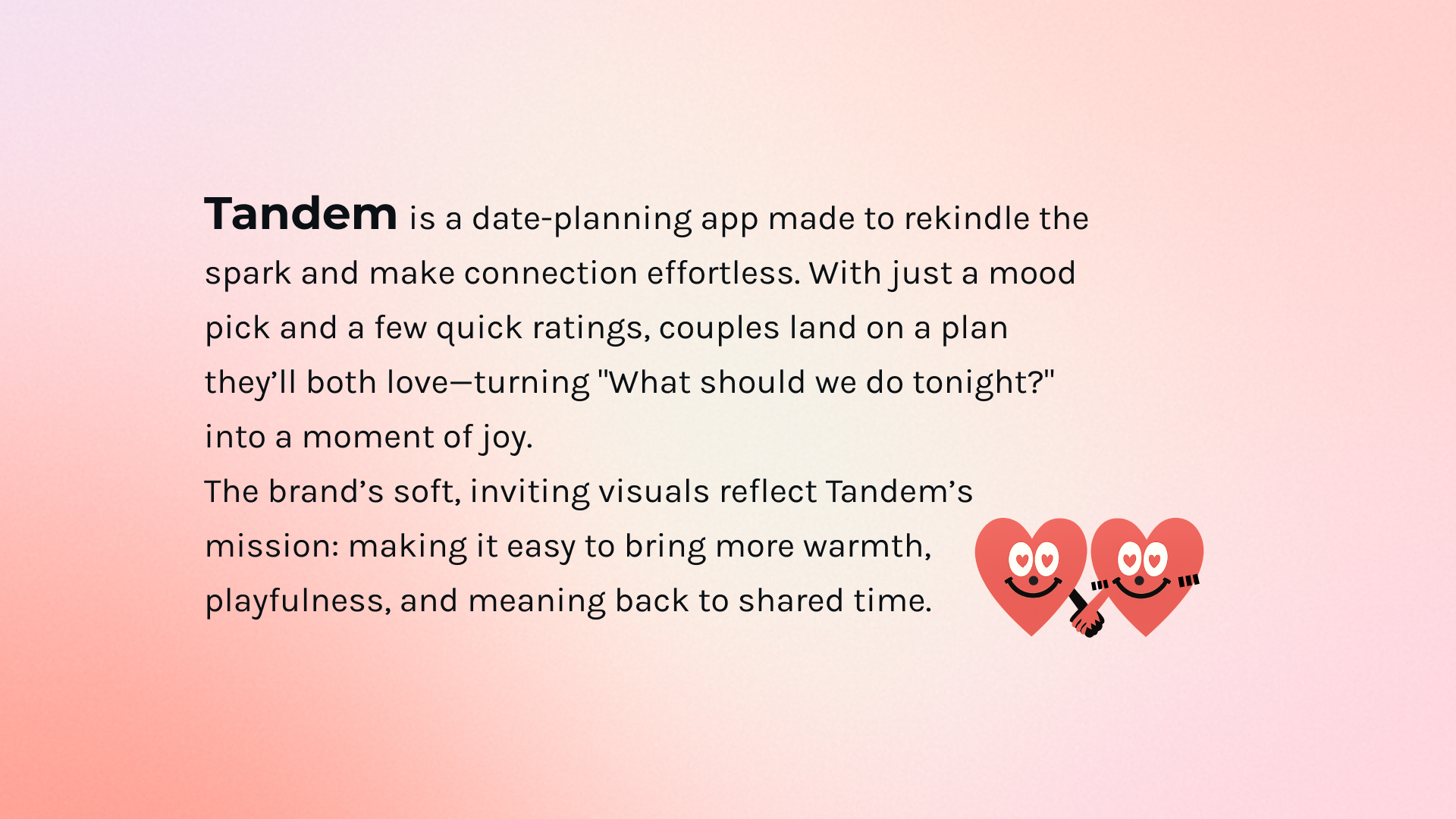
← back to graphic design
Brand · Product · UX · 2025

Tandem

The Brand Systems Lead

A character-driven brand system for a date-planning app — pairing playful softness with the rigorous logic of a two-user matching flow.

My role
Solo designer — brand identity, illustration, UX architecture, UI design, OOH art direction
Year
2025
The Brief

What Tandem is

Tandem brand background card with heart mascots holding hands on a soft pink gradient
Brand background — warmth, playfulness, and effortless connection.

Scaling the Brand

From a few pixels to massive physical environments — proving the brand system is robust enough to hold its character at every scale.

Tandem landing page mocked up on a laptop in a soft pink-purple environment
Pick a mood. Find your moment. Make it a date. — landing page hero on web.
Tandem out-of-home poster campaign with character-driven heart illustrations on the street
OOH campaign — heart mascots humanize the interface and translate a logical product into emotional shorthand.

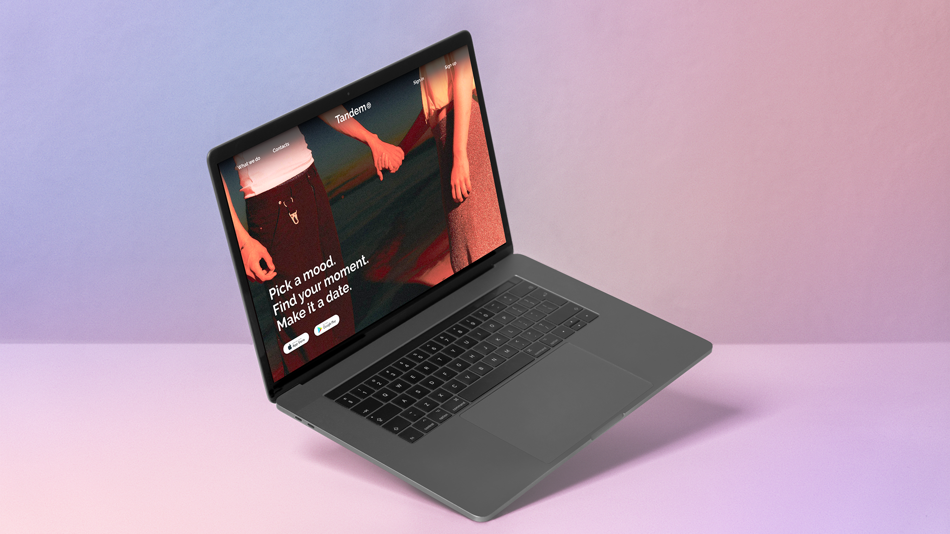
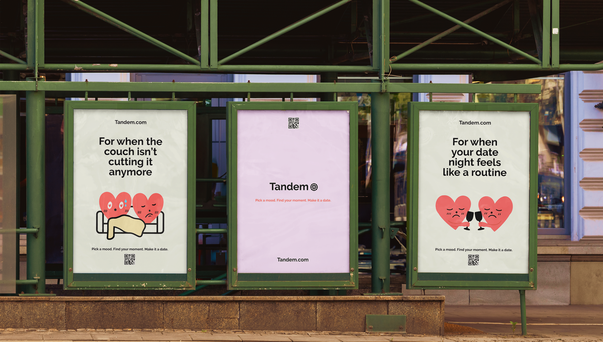
The visual identity is built on Playful Softness: a confident wordmark anchored by character-driven heart illustrations that act as brand mascots across product, print, and place.

The same soft type voice and character logic scales from in-app micro-interactions to street-level posters without losing precision — proving the system is ownable, flexible, and culturally fluent.

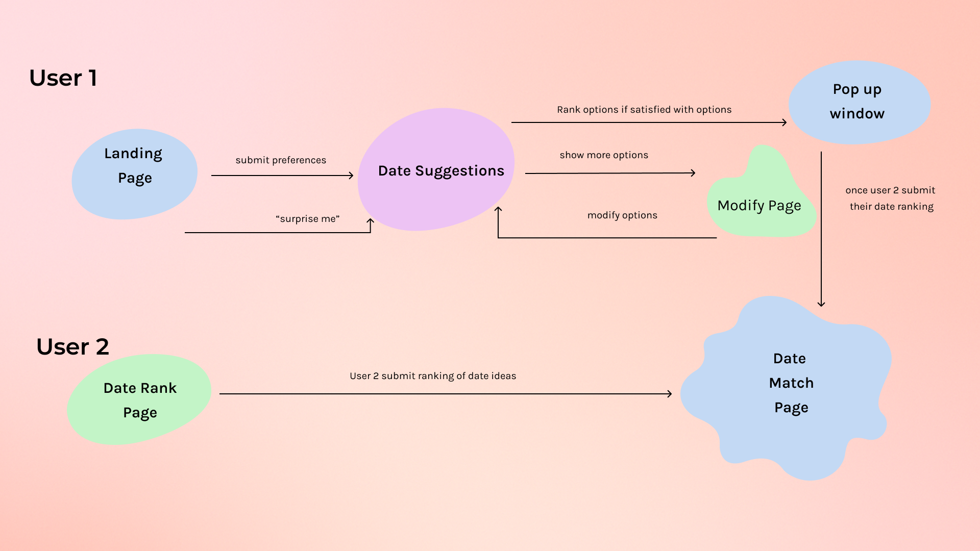
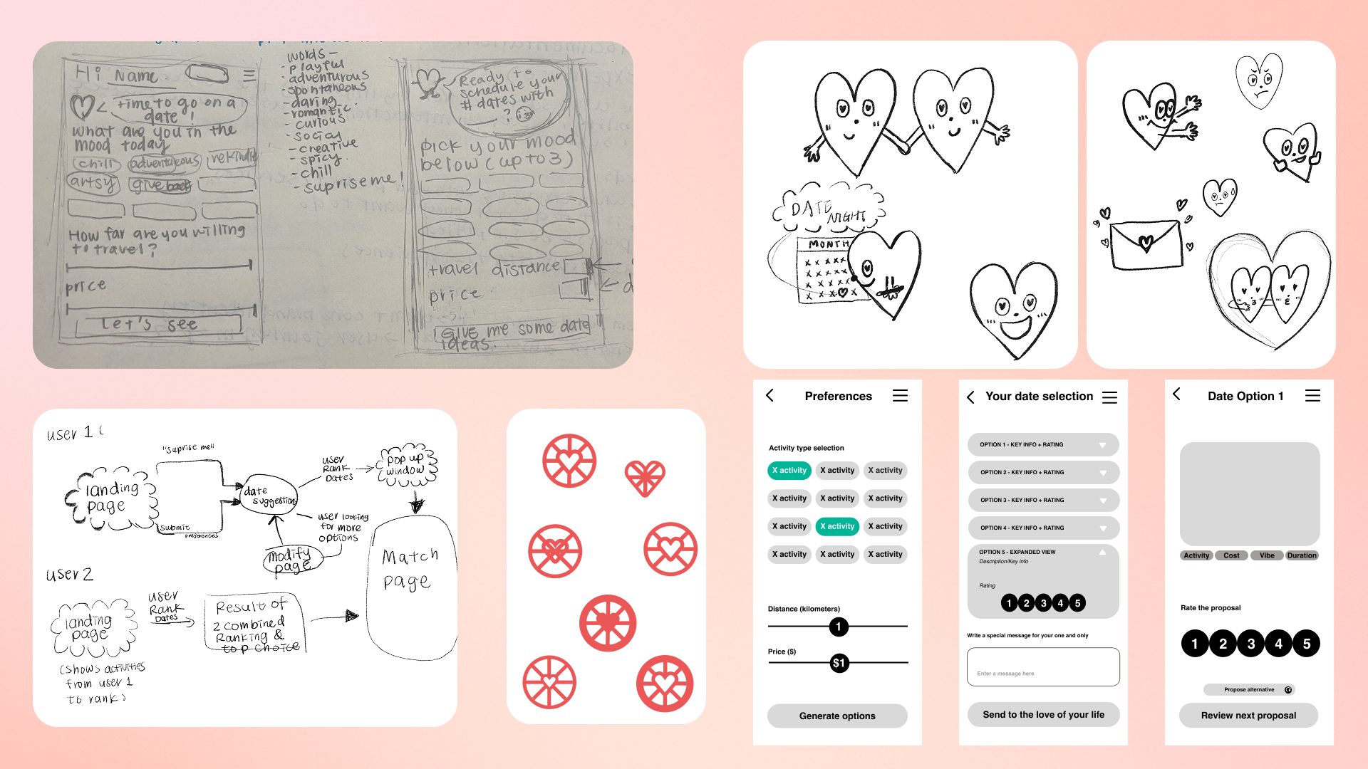
The User Journey Roadmap

The thinking behind the app — not just the colors. Hand-drawn sketches and a two-user logic flow that mapped how decision fatigue becomes anticipation.
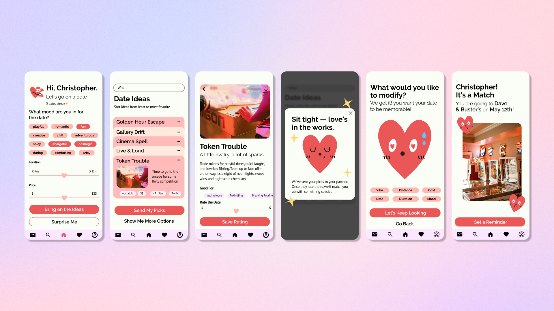
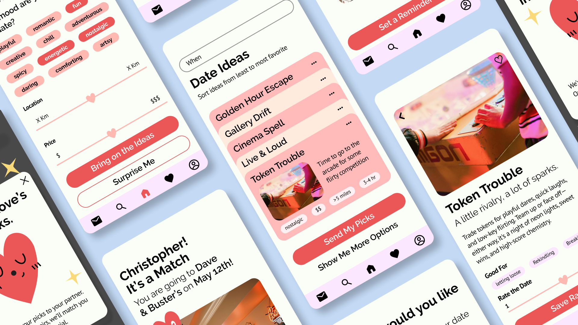
Hand-drawn user journey diagram showing the User 1 and User 2 flow across landing page, date suggestions, modify, pop-up, and date match pages
User 1 vs. User 2 logic flow — preferences, suggestions, ranking, and the moment of match.
Wireframe sketches and heart character explorations alongside mid-fidelity preference, ranking, and date option screens
From paper sketches and character studies to mid-fidelity flows for preferences, ranking, and date proposals.

The Final Product

The polished UI system in motion — mood selector, ranked date ideas, the “love's in the works” pause, and the final match moment. Character-driven on the surface, two-user logic underneath.

Six final Tandem app screens lined up: greeting and mood, date ideas list, Token Trouble detail, love's in the works pop-up, modify, and It's a Match
Mood → ideas → detail → “love's in the works” → modify → it's a match.
Angled perspective composition of multiple Tandem app screens layered together
The system in motion — character-driven UI with rigorous two-user logic underneath.

We replaced decision fatigue with anticipation, prioritizing emotional clarity over technical complexity.